Brewing Something Different.
Client
Groundhog Brewery
Groundhog Brewery is a conceptual craft beer brand built around a simple story. A group of groundhogs stealing hops from local farms to brew their own beer.
The challenge was to create a playful identity that could stand apart from the heavily illustrated and often chaotic world of craft beer, while still feeling distinctive enough to build personality across an entire range.
The result is a bold but considered identity where storytelling, ingredients and character come together through packaging, illustration and a flexible visual system.
Scope of Work

Digging Out the Idea.
The identity began with the idea of the groundhogs themselves. Rather than treating the mascot as decoration, the characters became part of the brand's world, giving each beer its own personality while connecting the range through one larger story.

Breaking Craft Beer Conventions.
Craft beer packaging often relies on highly detailed illustrations and visually busy labels. Groundhog takes a more restrained approach, using clean layouts, bold typography and focused illustration to create something playful without becoming cluttered.
Building the mark.
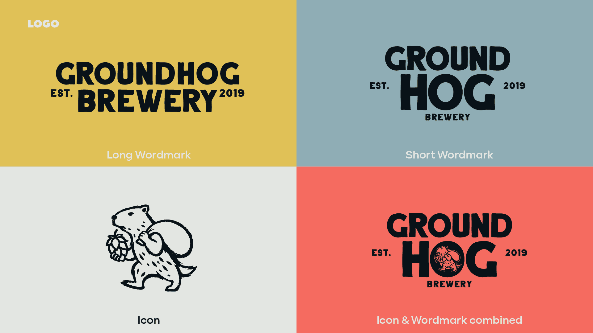
The logo combines a bold, straightforward wordmark with a groundhog character. It introduces the story immediately while remaining simple enough to work across bottles, packaging, merchandise and smaller brand applications.

Brewed with character.
The Ground Hog colour palette takes its cues from the brewing process itself, golden barley, dark roasted malts, cold refreshing pours and the agricultural roots behind every bottle.
Golden Barley acts as the distinctive brand colour, supported by a deep Midnight Stout and clean Brewer's Foam neutral. Harvest Red and Cold Brew Blue introduce brighter accents, allowing individual beers and brand communications to have their own personality while still belonging to one recognisable system.
The result is a palette that feels warm, crafted and playful without falling into the rustic visual clichés traditionally associated with craft beer.

Bold Type, Clear Hierarchy.
Typography was built around Kinetika, using its strong geometric forms to give the identity a contemporary and confident character.
Its range of weights creates clear hierarchy across packaging while balancing the more expressive illustrations, keeping information such as beer style, ABV and ingredients easy to navigate.

Giving Every Beer a Character.
Each beer introduces its own character and story, from the hop-carrying farmer of Farmer's Bliss to the unfortunate goose behind Drowned Goose.
The illustrations share a consistent visual language, allowing every bottle to feel individual while still clearly belonging to the Groundhog family.

Designing the Bottle.
The packaging balances personality with function. Illustration creates the initial impact, while beer style, ABV, ingredients, tasting information and brewing details are organised into a clear system around the bottle.
This creates packaging that rewards a closer look without sacrificing the information customers need when choosing a beer.

More Than a Label.
A set of ingredient and sensory icons was developed around hops, barley, taste and aroma, extending the identity beyond the main illustrations.
These smaller details help turn the packaging into a complete visual system rather than relying on the logo or mascot alone.

Building a Family.
Farmer's Bliss IPA, Drowned Goose Lager, Summer's Kiss Pale Ale and Blind Horse Stout each use their own colour, illustration and personality while sharing the same underlying packaging structure.
Together, the bottles create a recognisable family designed to work individually on a shelf or collectively as a range.